Pulseband
Cardiac Companion App
Project Review
Updated: Summer 2021

The Project + Context
A three-person team comprised of a UX Lead (me), a UI Designer, and Front-End Dev completed this project in 3 weeks. Using an Agile methodology, we divided the project into three (1-week) sprints. During this time, I created our research plan, personas, wireframes, and prototype. In addition, I also worked with my teammate to conduct testing and interviews.
Challenge
To design, research, and develop a Pulseband landing page and companion application for our client (DESIGNATION Labs).
Research
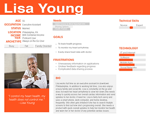
As UX lead, I began developing the research plan. I decided to include user interviews, SME interviews, competitor analysis, and domain research. These research findings were helpful as the team didn't know much about cardiac health or Pulseband competitors - this research informed the development of the personas and application design.


Pulseband's target user base included recovering heart attack victims and adult children looking to monitor their parents' cardiac health.
Ideate
With the research in mind, I began to ideate. After conducting my SME interviews, I learned patients often experience depression after cardiac episodes, and compliance is a main issue during patient recovery. I suggested a light, fun color palette for the app and gamification to make a depressing experience a bit more enjoyable and appealing to recovering patients. Paper sketches and wireframes came next.

User Testing
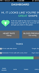
User testing the prototype was the next step. I created an interview guide and began testing users, along with my teammate. They pointed out areas that confused them, the parts they liked and provided helpful feedback.
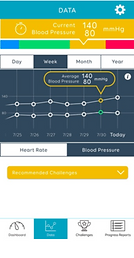
"On the data screen, I'd like to see the graph at the top." - Alicia
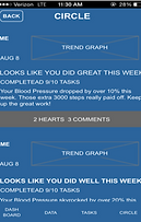
"Wait are there supposed to be circles here? What is the circle?" - Matt
"I view this as exercise instead of tasks. I also don't care whom I did it with. I am selfish about this." - Karen


"This page is very busy. I don't know where to draw my eyes. There's a lot of text. The font is too small, but the icons here did draw my attention." - Karen
"Is that circle of friends? What does that mean 'circle'?' Does that mean how do I compare to others? " - Alicia
Axure prototype with user feedback.
Feedback and Iteration
After user testing, I synthesized our findings to pinpoint unclear areas. Finally, the UI lead iterated the initial design and changed some wording. Colors were used to help denote hierarchy and create a simpler navigation process.


Final UI Mockup created by UI lead Jimmy Yoon.
Final landing page mockup created by UI lead Jimmy Yoon.
Reflections
For future projects, I plan to interview more SMEs and users. Connecting with a cardiologist, more nurses, and a health coach would be helpful. These professionals would help us learn about the common compliance-related issues these professionals notice from this population group.
Additional user research with recovering heart attack victims would provide greater insight into the users' emotional state and experience with existing products or services. Perhaps this feedback could garner greater empathy from the designers and potentially reveal unarticulated needs.
